
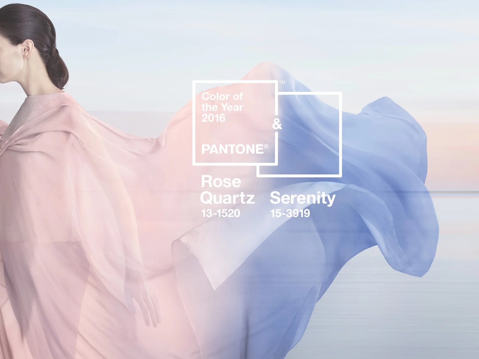
Every year the Pantone Color Institute looks to trends in fashion, art, design and culture to select a Color of the Year. For 2016, they chose not one, but two colors that work together to create a sense of balance: PANTONE 13-1520 Rose Quartz and PANTONE 15-3919 Serenity.
The warmth of Rose Quartz represents compassion and composure, while Serenity’s blue tones reflect calmness and relaxation. Together these two colors embody peace and tranquility.

We teamed up with Pantone to create a special Effects pack that celebrate Serenity, Rose Quartz and their harmonious nature. These Effects are intended to give your photos a soft, ethereal glow.

You can download it for free from our supply shop!